Much well-deserved attention has been paid in recent months to Richard Diebenkorn: The Berkeley Years at the de Young Museum in San Francisco, which is closing Sunday September 29. Many very good reviews have been written about the exhibition, so I just want to mention some personal revelations and insights. But first, here’s a little contextual background. The exhibition, called The Berkeley Years, focuses on the period between 1953 and 1966, when Richard Diebenkorn lived and worked in Berkeley. The work and career of this pivotal artist needs to be noted for a number of reasons; including major contributions to American art during the mid-twentieth century—Diebenkorn began showing his work in New York galleries in the late 1950s. But, perhaps more importantly, was the recognition he brought to, and influences he had, on the San Francisco Bay Area art history. Diebenkorn was born in Portland, Oregon in 1922, but was raised in San Francisco. His career as an artist and teacher allowed him to live in various parts of the country, as well as Berkeley and Santa Monica. Then, in 1988, he and his wife moved to Healdsburg, California, where he lived and continued making art until his death in 1993.
Diebenkorn played a prominent role in the development of the Bay Area Figurative movement, which evolved in the greater San Francisco area during the early 1950s. He, along with other early proponents, such as David Park and Elmer Bischoff, began incorporating representational and figurative subject matter into their paintings at a time when the predominant style in the United States was Abstract Expressionism. As a teacher in major Bay Area art schools, he also influenced the work of such important artists as Joan Brown and Manuel Neri. Eventually the Bay Area Figurative movement developed into one of the first distinctive styles to arise in Northern California and become nationally recognized in the wider art world.
While Diebenkorn’s early work reflected the influence of popular abstract trends, his later work evolved and changed through his many explorations, eventually returning to abstraction. In this exhibition of the Berkeley Years, the series demonstrates the sequential process of his work during this period and discloses the bridges, transitions, and flow between abstract and representational subject matter. For Diebenkorn the emotional explosions of Abstract Expressionism’s gesture paintings take on a more subtle psychological nuance. His figurative imagery is detached, impersonal, and still firmly integrated in an abstract framework.
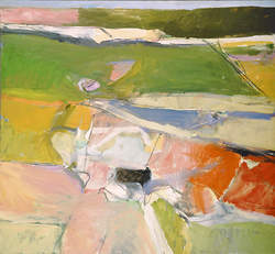
Berkeley #44, 1955, R. Diebenkorn.
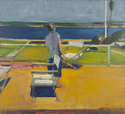
For example, when you view his abstract painting Berkeley #44, from 1955, compared with Figure on a Porch, from 1959, you can see how the green and gold patchwork of color areas in the former painting evolved to incorporate a figure on a porch viewing a landscape. Yet the figure, the furniture and the landscape all have the same relevance as geometric components to the composition as a whole.

Figure on a Porch, 1959, R. Diebenkorn.

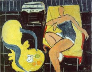
Man & Woman in a Large Room, 1957, R. Diebenkorn.
However, it seems that when Diebenkorn incorporates two figures, hints of psychological engagement begin to appear, such as can be noted in Man and Woman in Large Room, 1957, where even without facial features, a dialogue ensues between the two figures. Looking at this body of work with a contemporaneous and forward point of view provides one dimension to Diebenkorn’s work.
The Influence of Mattise
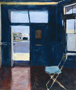
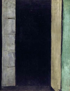
Another dimension unfolds by looking at the work of earlier artists who made a strong imprint on Diebenkorn; artists that were significant to his own development, not only during the period of the Berkeley years, but as a continuum—before and after as well. One of the strongest influences was that of Matisse, whose work Diebenkorn admired, and had access to while a student at Stanford University as well as at other points in his life. One striking comparison can be made by looking at Diebenkorn’s Interior with Doorway, from 1962, and Matisse’s Porte-Fenetre a Collioure, 1914. In Interior with Doorway, the overall composition of an interior scene has a clear abstract structure, there are no human figures, however an empty folding chair and open door imply human occupation and interaction. In Porte-Fenetre a Collioure, which was noticeably sparse and abstract for its time, the door stands ajar in a very flat space, but with even less human inference. Both paintings make use of muted ‘denim-blue’ color areas compressed by substantial vertical forms. And in both, the bones of the underlying geometry are exposed. The consideration of spacial movement between inside and outside is important to both artists, but while Diebenkorn’s doorway invites an outwardly telescoping view, Matisse’s portal peers into a shadowy interior space.
Porte Fenetre a Collioure, 1914, H. Matisse.

Interior with Doorway, 1962, R. Diebenkorn.
Other interesting similarities can be seen in the Matisse’s Dancer and Rocaille Armchair on a Black Background, 1942, when compared to Diebenkorn’s Figure on a Porch, 1959. In each a single abstracted figure, on a tilted flat space, is held within grids, lines and rectangles. The painting process of erasures and corrections is revealed just below the surface in both works.
Dancer & Rocaille Armchair on Black Background, 1942, H. Matisse.
Figure on a Porch, 1959, R. Diebenkorn.
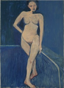
Nude on a Blue Ground, 1966, R. Diebenkorn.
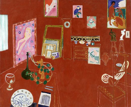
The one painting that stopped me in my tracks was Nude on Blue Ground, 1966. On first impression it’s so different from the other paintings in the series, yet familiar and so thoroughly Diebenkorn. A large female nude figure, standing in a dancer-esque pose, fills the canvas on a dark flat background. The many figure drawings in the exhibition affirm Diebenkorn’s familiarity and confidence in working with the figure. The signature brushwork, flatness of forms, and use of a simple inscribed line to suggest an interior space are very much Diebenkorn. The painting reflects back to Matisse, both in his dancer figures, but also in the use of sparsely inscribed lines to delineate forms and space. If you look at Matisse’s The Red Studio, 1911, though the red color dominates, the walls and objects are also inscribed with spare linear suggestions.

The Red Studio, 1911, H. Matisse.
Diebenkorn absorbed, internalized, and synthesized the work of other artists, but in the end made this ingestion distinctly his own. The signature Diebenkorn space, color, and angles are present in some form throughout most of his career.
The more than 120 paintings, collages, and drawings in the exhibition include abstract imagery along with landscapes, figures, interiors, and still lifes. Richard Diebenkorn: The Berkeley Years continues at the de Young Museum through September 29. For more information about the exhibition and related programs check their website, famsf.org.
Berkeley #44, 1955, Richard Diebenkorn. image from famsf.org
Figure on a Porch, 1959, Richard Diebenkorn. image from famsf.org
Man & Woman in Large Room, 1957, Richard Diebenkorn. image from wikipaintings.org
Interior with Doorway, 1962, Richard Diebenkorn. image from famsf.org
Porte Fenetre a Collioure, 1914, Henri Matisse. image from henri-matisse.net
Dancer & Rocaille Armchair on a Black Background, 1942, Henri Matisse. image from wikipaintings.org
The Red Studio, 1911, Henri Matisse. image from moma.org